/design/
The Australian design world seems to have an obsession with Scandinavian design. Go into just about any Australian based furniture retailer and you’ll find an abundance of wooden, circular, tripod tables with tapered 1960s legs and some Nordic sounding name like ‘Dansk’, ‘Scandi’, ‘Nord’, or ‘Stockholm’. Similarly, if you search #scandinaviandesign on Instagram you’ll come up with 58000 results and find a massive Australian retailer towards the top of the search because they are, apparently, the epitome of Scandinavian design.
But what is Scandinavian design? It’s all wood, white and minimalism right? Well, the 2015 collection from up-and-coming Copenhagen design house Frama seems to suggest otherwise. I first came across Frama at the Stockholm Furniture Fair (SFF) and have been fascinated ever since. Each year SFF showcases the latest ranges from the best emerging and established Scandinavian and European designers. These are the sort of furniture collections that make you feel a little inadequate. No matter how “on trend” your current home wares are, these will make you want to burn everything you currently own and start again. The Frama collection is no exception.
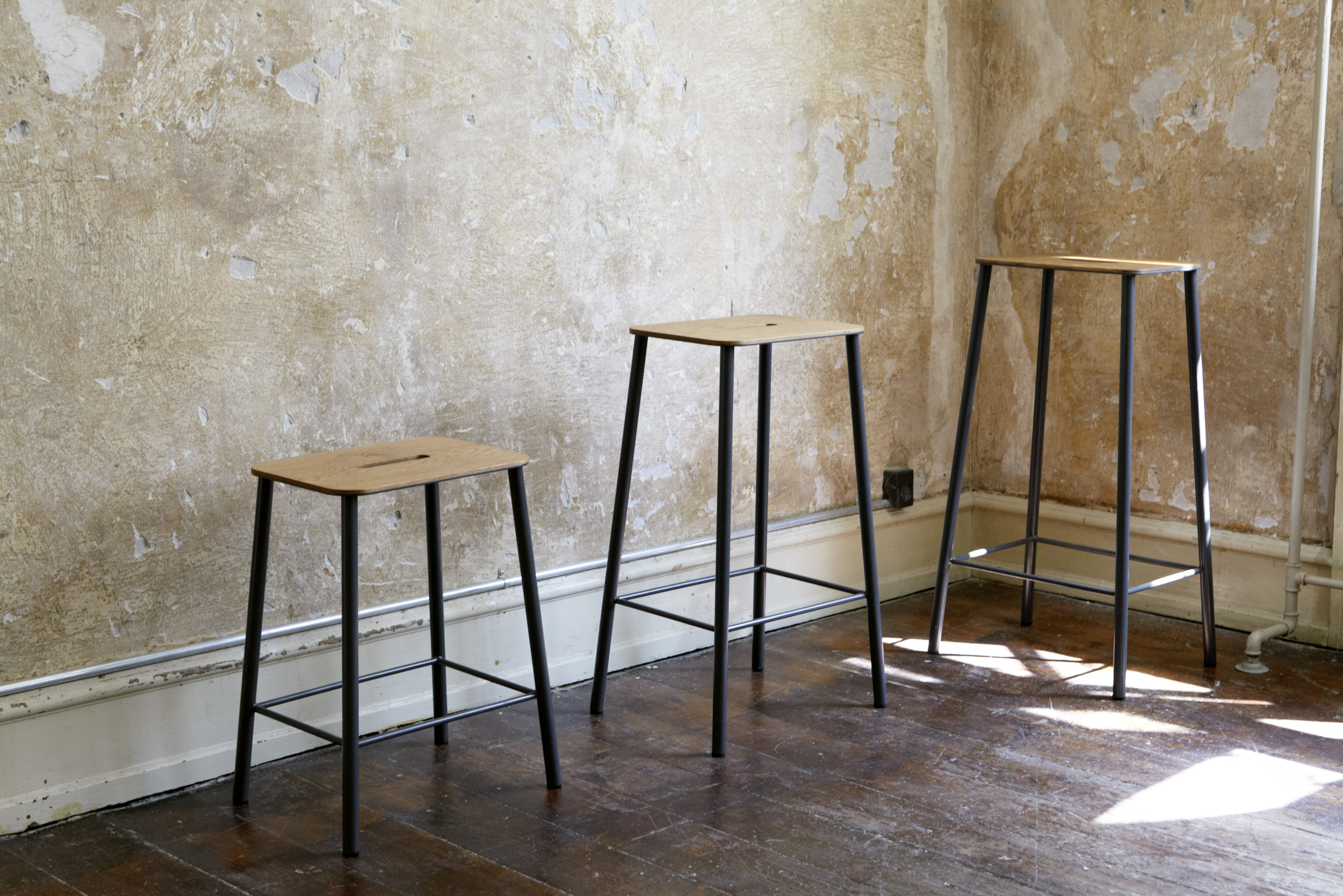
Frama was established in 2011 and since then has completely embodied the essence of modern Scandinavian design. In the Frama collection you will not find any tapered legs and the thought of incorporating a stark white in this warm collection seems counter-intuitive. The range itself is quite small, but carefully considered. It is separated in to three categories; furniture, accessories and lighting. Their furniture includes mostly small scale pieces; stools, trestles, shelves, tables and benches, while their accessories focus on their stoneware collection, and their lighting range explores bulb shape and pendants. While this collection seems to fit with the Australian idea of Scandinavian design because of the clean minimalist form, what truly differentiates Frama are the materials that have been chosen.
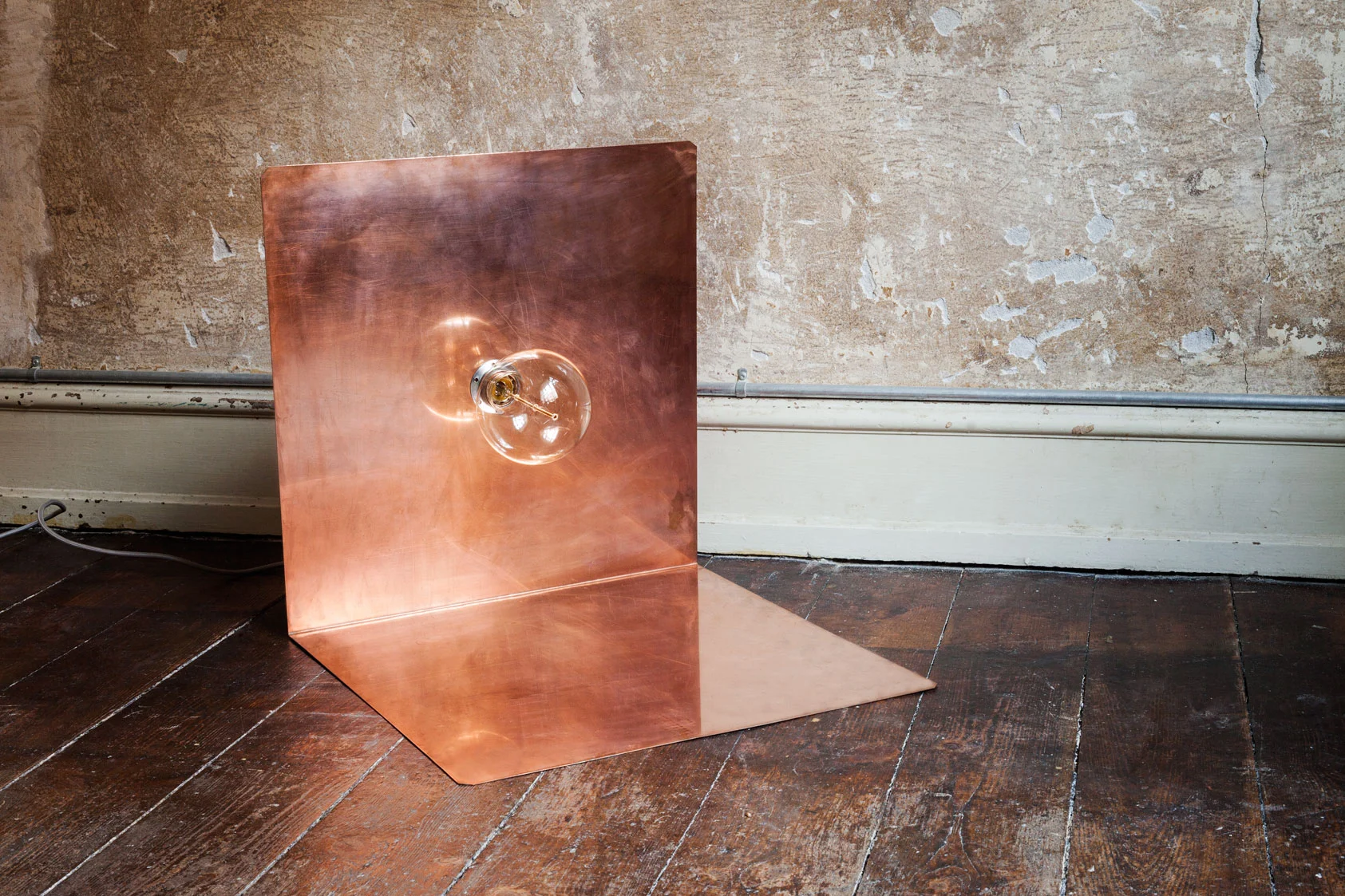
In contrast to more basic materials used in stereotypical Scandinavian design, the Frama collection incorporates a combination of rich walnut, aged copper, clean powder coated steel and dense stone. I can’t emphasise their use of aged copper enough, because not only do they use it in most of their products, but it’s the interesting use of the metal that gives Frama pieces a unique edge. They’ve bent, moulded and pressed copper to incorporate it into angular shelves, brackets and lighting.
According to the Frama case study, which the design house completed about their new collection, “The Frama collection focuses on solid materials with natural finishes and simple geometry”. The effect of these finishes is that each piece does not only look luxurious, it feels and smells luxurious. Their wood-based furniture emanates a full bodied aroma. It gives me a sense of childlike nostalgia mainly because the rich walnut smell is reminiscent of my parent’s front deck when it had been freshly lacquered. By moving away from the commonly used oak and replacing it with slightly softer walnut, Frama has developed a homely furniture range that is strong and durable, without being excessively heavy or rigid.
This sense of substantial material is carried over into their stoneware range. The stone cups and plates feel solid, smooth and lavish. They follow seemingly endless lines which never appear stagnant. The use of stone for everyday dining items also adds a sense of practicality, like you could actually use them without feeling like they would shatter in your hand. In fact, the whole collection is delicate without being fragile. This comes back to the true essence of Scandinavian design which is the idea of genuine practicality and undemanding aesthetic. The Frama case study also explores this concept, “The objects within the collection signal a return to the basics, where the design appearance aims to be honest and pure. Working within the area of design archetypes, Frama represents a graphical and straight forward aesthetic approach to design”.
Oslo based interior stylist Jannicke Krakvik, whose furniture boutique Kollekted is one of Frama’s key stockists, spoke to me about the resurgence of practical furniture in the 2015 collection. She said her favourite Frama piece is ‘SutoaI’ by Keiji Ashizawa because it encompasses the idea of functionality and aesthetic, “think (about) the simplicity and the thought behind it. It’s furniture that can come with you”.
Frama ticks all the boxes of sleek design, intuitive nature and timelessness, but for me what makes Frama even more beautiful is that it is a massive collaboration. There is a team of 11 designers behind this bite size collection. It just makes every piece that bit more personal, these are more than products they are labours of love. I seriously enjoy everything Frama has to offer. From trestles to stoneware, everything is eye catching but not attention seeking.
The Frama 2015 collection truly demonstrates, frankly, how much of the nuance we’ve missed. Scandinavian design is not just white, fragile and empty; rather it is full bodied, aromatic and engaging. Scandinavian design has aesthetically moved passed stereotypes of stark minimalist furniture design where the pieces are composed of singular materials, and has developed into a model where the range of materials used is actually a design element itself. It has done this while bringing back the underpinnings of mid-century design: functionality and form.


